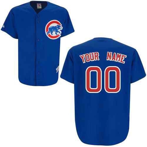
In the realm of baseball fandom, few debates ignite as much passion as the choice between a team’s primary and alternate uniforms. For the Chicago Cubs, that debate often centers on their iconic blue jerseys—specifically, the distinction between the traditional royal blue and the softer light blue variants. These aren’t just pieces of fabric; they’re symbols of legacy, identity, and even psychological influence on players and fans alike. But which shade truly commands attention? Which one tells a more compelling story? The answer may surprise you.
The Psychology of Blue: Why Shade Matters in Sports Uniforms
Color psychology in sports is a science as much as it is an art. Blue, universally associated with trust, stability, and professionalism, is a favorite among teams for its calming yet authoritative presence. However, the Cubs’ two blue hues—royal and light—evoke different emotions. Royal blue, with its deep, saturated tones, exudes dominance and tradition, a hue that has clad the Cubs since their early days. Light blue, on the other hand, feels more approachable, almost whimsical, as if it’s inviting fans into a lighter, more playful version of the team’s identity. Studies suggest that lighter shades can subconsciously reduce perceived aggression, which might explain why some players feel more at ease in them during high-pressure games. The question isn’t just about aesthetics; it’s about how the uniform influences performance and perception.
A Tale of Two Blues: Historical Roots and Modern Evolution
The Cubs’ royal blue jersey is a relic of baseball’s golden era, a visual echo of the 1930s and 1940s when teams embraced bold, unapologetic colors. This shade became synonymous with the Cubs’ resilience, their underdog spirit, and the ivy-covered walls of Wrigley Field. Light blue, however, is a more recent phenomenon—a deliberate shift toward modernity. Introduced as an alternate uniform, it nods to the team’s versatility while paying homage to its past. The light blue jersey often features subtle design tweaks, like pinstripes or vintage-inspired lettering, which blur the line between nostalgia and innovation. When players step onto the field in light blue, they’re not just wearing a uniform; they’re wearing a bridge between eras.
On-Field Impact: Does the Shade Affect Performance?
While no study definitively proves that a uniform’s color alters athletic performance, anecdotal evidence from players suggests otherwise. Some athletes report feeling more agile in lighter uniforms, as if the fabric itself reduces drag. Others claim that royal blue’s intensity sharpens their focus, turning the jersey into a psychological armor. The Cubs’ coaching staff has historically rotated between the two, using them as tactical tools—royal blue for high-stakes games where intimidation matters, light blue for early-season matchups or charity events where approachability is key. Even the fans play a role; studies show that teams in lighter uniforms tend to receive more positive social media engagement, as if the color itself softens the team’s public image. Could this be the Cubs’ secret weapon in an era where perception often trumps reality?
Fan Fandom: Which Jersey Sparks More Devotion?
The debate among Cubs fans is as heated as a playoff run. Traditionalists argue that royal blue is sacrosanct, a non-negotiable part of the team’s soul. To them, light blue feels like an unnecessary dilution of heritage. Yet, a growing faction of younger fans and casual observers adores the light blue for its freshness, its Instagram-worthy appeal. Social media polls reveal a fascinating divide: older fans lean toward royal blue by a landslide, while Gen Z supporters often prefer the lighter shade for its versatility in styling. The light blue jersey has become a canvas for fan creativity, often paired with denim jackets or retro sneakers, whereas royal blue remains the uniform of choice for game-day rituals. Which side will win? Perhaps the answer lies in the team’s future—will the Cubs embrace a new identity, or cling to the past?
Design Nuances: The Devil in the Details
Beyond color, the two jerseys differ in subtle yet significant ways. Royal blue typically features a more structured, almost military-like font for player names and numbers, reinforcing its authoritative presence. Light blue, conversely, often employs a cursive or vintage script, evoking the hand-painted signs of Wrigley’s early days. The stitching, too, varies—royal blue jerseys may include reinforced seams for durability, while light blue versions prioritize breathability for warmer months. Even the logos subtly shift; the light blue jersey’s “Cubs” script sometimes appears in a slightly arched, more dynamic layout, as if the team is leaning into motion. These details aren’t arbitrary; they’re deliberate choices that shape how the uniform is perceived, both on the field and in the stands.
The Cultural Shift: How Alternate Uniforms Redefine Team Identity
Alternate uniforms like the Cubs’ light blue jersey aren’t just fashion statements—they’re cultural artifacts. They allow teams to experiment, to tell new stories without erasing old ones. For the Cubs, light blue has become a symbol of adaptability, a nod to their willingness to evolve while honoring tradition. It’s a jersey that can be worn to a rooftop party in Wrigleyville or a corporate sponsorship event, bridging gaps between different facets of fandom. Royal blue, meanwhile, remains the uniform of record, the one that carries the weight of championships and heartbreaks. But in an era where sports are as much about spectacle as they are about competition, could the light blue jersey be the key to attracting a new generation of fans?
Final Verdict: Which Blue Reigns Supreme?
The answer, of course, depends on who you ask. For purists, royal blue is the only choice—it’s the color of Ernie Banks’ smile, of Ron Santo’s loyalty, of a franchise that has weathered storms with grace. For innovators, light blue represents the future—a future where tradition and modernity coexist. But perhaps the most compelling argument is that both jerseys are essential. Royal blue for the battles that define the Cubs’ legacy, light blue for the moments that define their spirit. In the end, the debate isn’t about which is better; it’s about how each shade contributes to the team’s rich, ever-evolving narrative. So the next time you see a Cubs player step onto the field, ask yourself: which blue tells the story you want to remember?