The Chicago Cubs have once again dipped their toes into the vibrant pool of sports fashion innovation with their latest City Connect jerseys. Designed to celebrate the city’s unique identity, these uniforms are more than just fabric and thread—they are a sartorial love letter to Chicago’s grit, its architectural grandeur, and its unyielding spirit. But in a world where sports apparel trends flicker like neon signs in the Windy City’s winter chill, the question lingers: Are these jerseys the pinnacle of creative expression, or merely another overhyped trend destined for the back of the closet? Let’s dissect this sartorial spectacle with the precision of a surgeon’s scalpel and the reverence of an art critic.
The Alchemy of Design: Where Tradition Meets Modernity
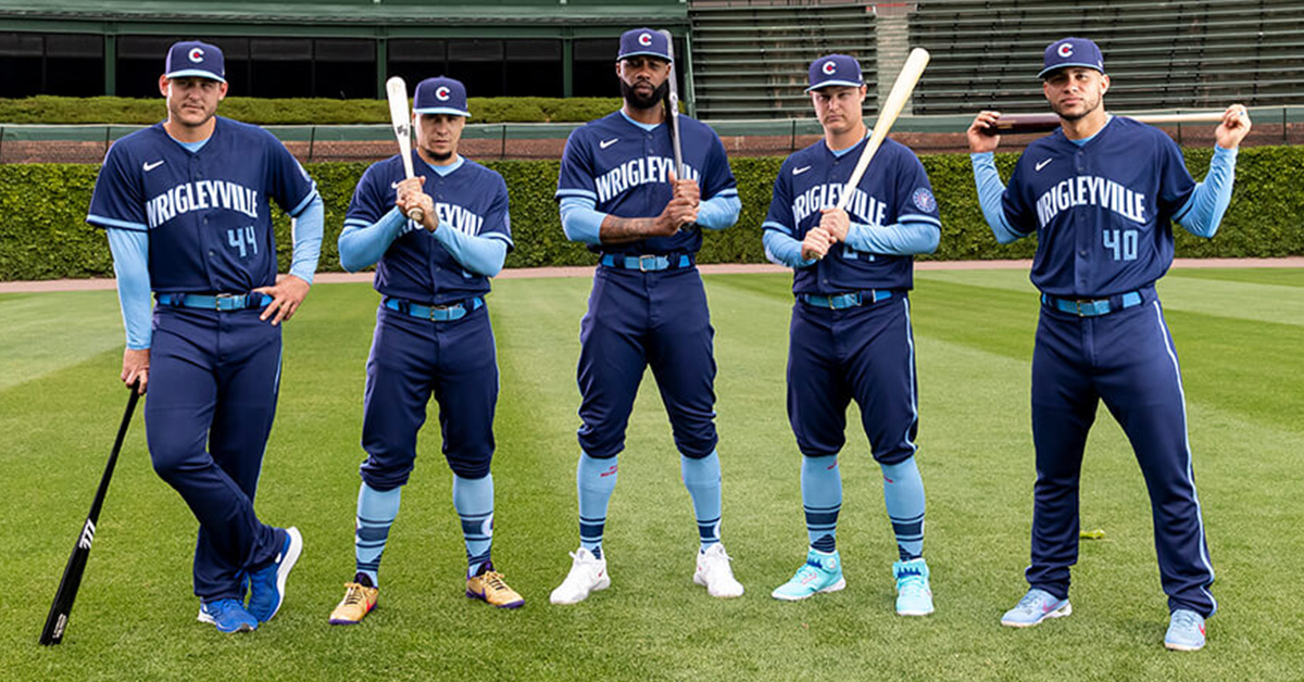
The Cubs’ City Connect jerseys are not mere replicas of their classic pinstripes; they are a transmutation of tradition into something fresh, something alive. The primary palette—deep navy blue, electrifying teal, and bursts of orange—evokes the hues of a sunset over Lake Michigan, while the bold, asymmetrical stripes running down the sleeves resemble the jagged skyline of the city itself. This is not just a jersey; it’s a wearable mural, a canvas that captures the essence of Chicago in every stitch.
The teal, in particular, is a masterstroke. It’s a color that doesn’t just sit on the fabric—it dances, a nod to the city’s Irish heritage and its undying love for the Chicago River’s murky depths. The orange, a subtle yet unmistakable homage to the Cubs’ classic brick-red, ties the design back to the team’s roots, ensuring that even in its boldness, the jersey remains unmistakably Cubbie blue.
The Psychology of Color: Why These Hues Resonate
Colors are not just visual stimuli; they are emotional triggers. The deep navy anchors the design, providing a sense of stability and tradition, much like the Cubs’ storied history. The teal, meanwhile, is a psychological catalyst, evoking feelings of creativity and resilience—qualities that define both the city and its baseball team. And then there’s the orange, a color that commands attention, much like the Cubs’ fanbase, which is as passionate as it is unwavering.
Studies in color psychology suggest that teal is associated with clarity and calm, yet its vibrancy ensures it doesn’t fade into the background. It’s a color that demands to be seen, much like the Cubs’ new uniforms demand to be noticed. The contrast between the navy and teal creates a visual tension, a dynamic that mirrors the city’s own push-and-pull between its industrial past and its gleaming future.
The Fabric of Identity: How the Jersey Wears Its Heart on Its Sleeve
Beyond the colors, the texture of the jersey plays a crucial role in its appeal. The fabric is lightweight, breathable, and designed for movement, ensuring that players aren’t weighed down by tradition. The material itself is a nod to the city’s industrial heritage, a subtle reminder that even in its elegance, the jersey is built to endure.
The collar, a standout feature, is a hybrid of classic and contemporary—a v-neck that nods to modern athletic wear while maintaining a touch of retro charm. The sleeves, adorned with the asymmetrical stripes, are not just decorative; they are a functional homage to the city’s architectural marvels, the way they twist and turn against the skyline. Every element of the jersey is meticulously crafted to ensure that it doesn’t just look good—it feels good, both on and off the field.
Fanfare and Fandom: The Cultural Impact of the City Connect Jerseys
The Cubs’ City Connect jerseys are more than just uniforms; they are a cultural phenomenon. They tap into the city’s collective identity, giving fans a way to wear their pride on their sleeves—literally. The jerseys have become a symbol of unity, a way for Chicagoans to rally around their team while celebrating the city that birthed them.
Social media has been ablaze with reactions, from awe-struck fans posting photos of their new gear to debates about whether the design is a stroke of genius or a misstep. The jerseys have sparked conversations, not just about fashion, but about what it means to be a Chicagoan. They’ve become a conversation starter, a way for fans to connect with each other and with the city they love.
Yet, with great visibility comes great scrutiny. Some critics argue that the jerseys are too bold, too unconventional for a team with such a rich history. But isn’t that the point? The Cubs have never been a team to shy away from boldness. From the ivy-covered walls of Wrigley Field to the team’s iconic cursive logo, the Cubs have always embraced their uniqueness. The City Connect jerseys are just the latest chapter in that story.
The Great Debate: Best Design Yet or Overhyped Gimmick?
The question remains: Are these jerseys the best the Cubs have ever produced, or are they merely a fleeting trend? To answer that, we must consider the broader context of sports fashion. The City Connect jerseys are part of a larger movement in which teams are using uniforms to tell stories, to connect with their cities, and to create a sense of belonging among fans.
In this light, the Cubs’ jerseys are not just a design choice; they are a strategic move. They align the team with the city’s identity, making the Cubs more than just a baseball team—they become a symbol of Chicago itself. And in a city that prides itself on its resilience and creativity, that’s no small feat.
Of course, time will tell whether these jerseys stand the test of time. Will they become as iconic as the team’s classic pinstripes, or will they fade into obscurity like so many other trends? Only the future holds the answer. But for now, the Cubs’ City Connect jerseys are a triumph of design, a celebration of identity, and a testament to the power of fashion to unite and inspire.
The Legacy of the Jersey: More Than Just Fabric
The true measure of the Cubs’ City Connect jerseys lies not in their initial reception, but in their lasting impact. Will they become a staple of the team’s uniform rotation, a yearly tradition that fans look forward to? Or will they be a one-season wonder, a flashy experiment that fades into memory?
What’s certain is that these jerseys have already left their mark. They’ve sparked conversations, inspired creativity, and given fans a new way to express their loyalty. They’ve reminded us that sports uniforms are not just about performance—they’re about identity, about storytelling, and about the unique alchemy of team and city.
In the end, the Cubs’ City Connect jerseys may not be the best design the team has ever produced. But they are certainly among the most thought-provoking, the most daring, and the most evocative. They are a jersey that doesn’t just cover the body—it captures the soul.