The Houston Astros have long been a franchise defined by their uniforms—bold visual statements that mirror the city’s resilience, innovation, and unapologetic flair. From the utilitarian flannel of the 1960s to the futuristic rainbow stripes of the 2010s, each iteration tells a story not just of baseball, but of Houston itself: a metropolis that thrives on reinvention, where tradition and progress collide in the most vibrant ways. What makes these uniforms so captivating isn’t merely their aesthetic appeal, but the way they encapsulate the spirit of a team that has navigated triumph, controversy, and transformation with equal measure. The Astros’ jerseys are more than fabric and thread; they are wearable chronicles of a franchise’s journey through the shifting tides of sports culture.
The Birth of a Look: The Colt .45s and the Humble Beginnings
When the Houston Colt .45s debuted in 1962, their uniforms were a study in understated pragmatism, a far cry from the sartorial audacity that would later define the franchise. The original design featured a muted orange and navy palette, evoking the industrial hues of a city still carving its identity from the Texas soil. The team’s name, emblazoned in a serif font across the chest, paid homage to Houston’s Wild West roots, a nod to the Colt revolvers that once tamed the frontier. Yet, beneath this historical veneer lay a deeper truth: the Colt .45s were a team born from ambition, not nostalgia. The uniforms, while conservative by modern standards, reflected the era’s baseball aesthetic—clean, functional, and devoid of the flash that would later become the Astros’ signature. This was a franchise in its infancy, still finding its footing, both on the field and in the public imagination.
The Astrodome Era: A Leap into the Future
The transition from Colt .45s to Astros in 1965 coincided with a seismic shift in Houston’s identity—the arrival of the Astrodome, the world’s first domed stadium. With this architectural marvel came a uniform redesign that mirrored the city’s futuristic aspirations. The new look abandoned the Colt’s earthy tones for a celestial theme: deep navy blue, vibrant orange, and a bold white star adorning the cap, symbolizing Houston’s place in the space race. The “rainbow” stripes, a hallmark of the era, weren’t just decorative; they were a visual metaphor for the optimism of the 1960s, a decade when humanity dared to reach for the stars. The Astros’ uniforms became a bridge between the Old West and the Space Age, a duality that would come to define Houston’s character. Yet, this era also introduced an early tension—between tradition and innovation—that would resurface in later decades.
The Tequila Sunrise and the Rise of a Cultural Icon
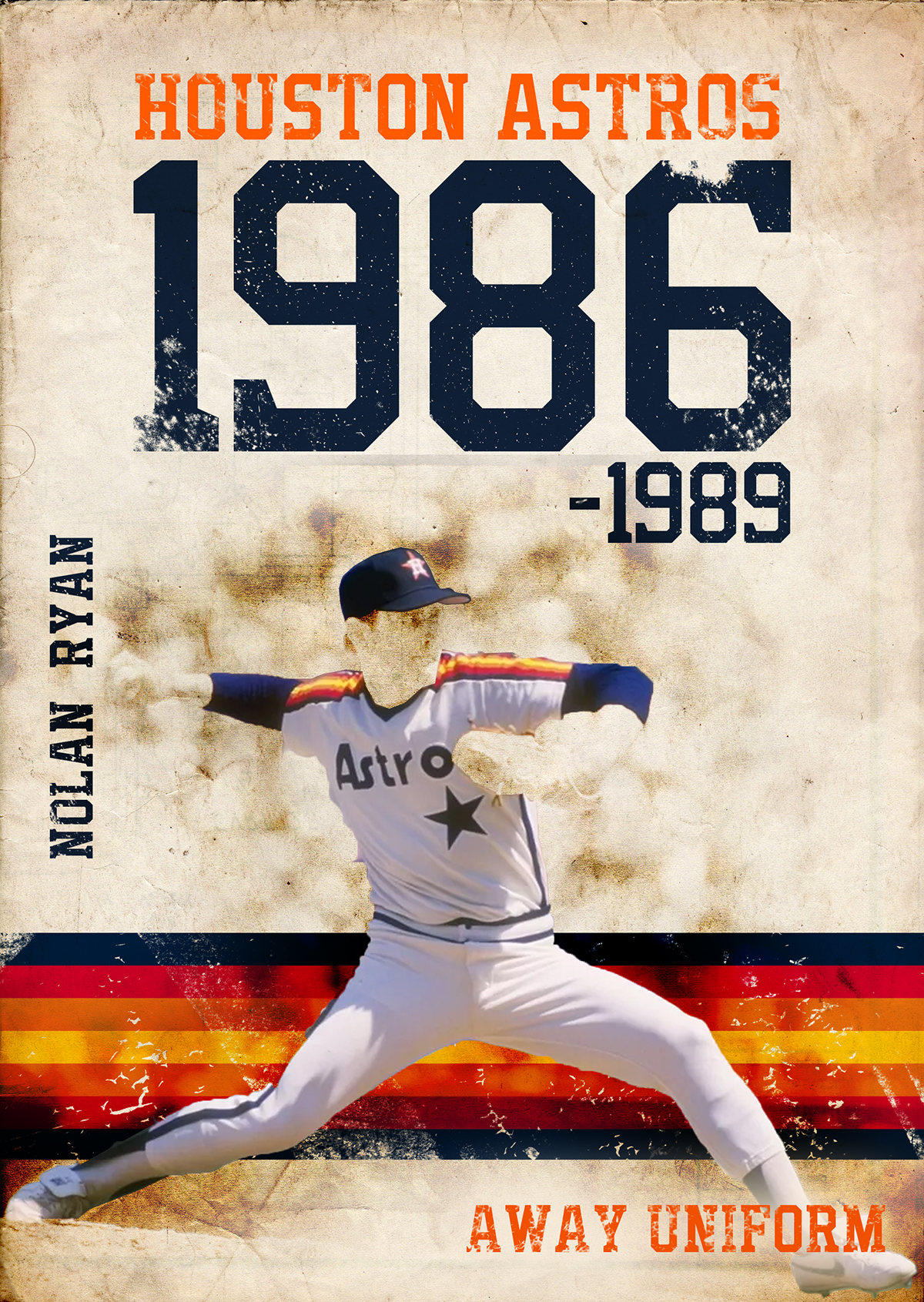
By the 1970s, the Astros had fully embraced their role as Houston’s ambassadors to the world, and their uniforms reflected this newfound swagger. The introduction of the iconic “Tequila Sunrise” design in 1975 was more than a fashion statement; it was a cultural earthquake. The gradient of orange, yellow, and red—reminiscent of a sunset over the Gulf of Mexico—transformed the Astros into a team that didn’t just play baseball, but embodied it. This was the era of Nolan Ryan’s blazing fastballs and José Cruz’s electrifying speed, and the uniforms seemed to channel that energy. The bold, almost psychedelic stripes didn’t just stand out on the field; they became a symbol of Houston’s multicultural vibrancy, a city where cowboys, astronauts, and oil barons all rubbed shoulders. The Tequila Sunrise wasn’t just a look—it was a lifestyle, a declaration that the Astros were here to entertain, not just compete.
The Dark Ages: Uniforms as a Reflection of Struggle
The 1990s and early 2000s were a period of adversity for the Astros, both on and off the field, and their uniforms mirrored this turbulence. The departure from the Tequila Sunrise in 1994 marked a return to simplicity, even austerity, with a navy and orange scheme that felt almost apologetic. The removal of the star from the cap in 2000 was a subtle but telling shift, as if the franchise was retreating from its bold past. These uniforms lacked the flair of previous eras, yet they carried a quiet dignity, a reflection of a team that was rebuilding from the ground up. There was a sense of humility in these designs, a recognition that greatness is not achieved overnight. Yet, for fans who had grown up with the rainbow stripes, this era felt like a betrayal—a dilution of the Astros’ identity in favor of a more corporate, less distinctive aesthetic.
The Renaissance: The Return of the Rainbow and a New Identity
The 2010s heralded a resurgence for the Astros, both in terms of performance and branding, and their uniforms played a pivotal role in this revival. The reintroduction of the rainbow stripes in 2013 was more than a nostalgic throwback; it was a deliberate statement of intent. The Astros were no longer the underdogs—they were contenders, and their uniforms reflected this newfound confidence. The modernized version of the Tequila Sunrise design, with its cleaner lines and updated color palette, bridged the gap between past and present. This era also saw the introduction of alternate uniforms, including the striking navy “City Connect” jerseys, which paid homage to Houston’s industrial heritage with a gritty, urban aesthetic. The uniforms became a canvas for storytelling, each detail—from the subtle star on the cap to the bold “H” script—reinforcing the Astros’ connection to their city and their fans.
The Science of the Stripe: Why the Rainbow Endures
At first glance, the Astros’ rainbow stripes might seem like a simple design choice, but their endurance speaks to something deeper: the power of visual storytelling in sports. These stripes are not random; they are a deliberate fusion of color theory, cultural symbolism, and psychological impact. Orange, the dominant hue, is associated with energy and enthusiasm, while the gradient effect creates a sense of movement, as if the uniform itself is in motion. The stripes also serve a practical purpose, breaking up the visual lines of the body and making players appear more dynamic on the field. Yet, their true magic lies in their ability to evoke emotion. For older fans, the rainbow stripes are a link to childhood memories; for newer fans, they represent a legacy of resilience. In an era where uniforms are often designed by committee, the Astros’ stripes stand out for their authenticity—they feel less like a marketing decision and more like an organic extension of the team’s soul.
The Future of Astros Uniforms: Innovation Meets Tradition
As the Astros continue to evolve, so too do their uniforms, striking a balance between innovation and reverence for the past. Recent designs have experimented with new fabrics, moisture-wicking technologies, and even augmented reality elements, ensuring that the uniforms remain at the cutting edge of sportswear. Yet, the core elements—the star, the rainbow stripes, the bold color palette—remain intact, a testament to the enduring power of tradition. The challenge for the Astros will be to innovate without alienating the fans who have supported them through every era. The uniforms of the future may incorporate sustainable materials or smart fabrics that adapt to weather conditions, but they will always carry the DNA of Houston’s indomitable spirit. In a sport where change is constant, the Astros’ uniforms remind us that some things—like a city’s grit and a team’s heart—are timeless.