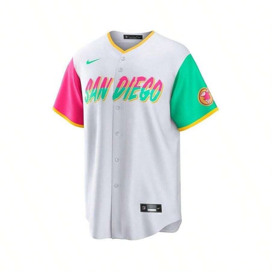
The debate over baseball jerseys has always been a curious blend of fashion, fandom, and function. Yet, few designs ignite as much fervor as a team’s “City Connect” collection—a line meant to celebrate local culture, history, and identity. Fernando Tatis Jr.’s latest San Diego Padres City Connect jersey, draped in pristine white with subtle nods to the city’s maritime soul, has become the epicenter of this conversation. Is it the franchise’s most inspired creation yet, or merely another overhyped marketing ploy in the endless cycle of athletic apparel? The answer, as with most things in sports, is layered.
The Aesthetic Alchemy: How the Design Captivates the Eye
At first glance, the jersey’s white base evokes the sun-bleached beaches of La Jolla, while the San Diego skyline subtly stitches itself into the fabric like a whispered secret. The Padres’ signature brown and gold accents—reimagined here as delicate, almost ethereal threads—pay homage to the city’s Spanish colonial roots without resorting to cliché. What sets this design apart is its restraint. Unlike the gaudy, neon-drenched uniforms of other teams, this jersey whispers rather than shouts, inviting wearers to feel the weight of San Diego’s history rather than its noise.
The collar, a standout feature, borrows from vintage baseball aesthetics, evoking the golden era of the sport while maintaining a modern silhouette. The sleeves, adorned with a repeating wave motif, nod to the Pacific’s rhythmic pulse, a clever touch that transforms the jersey from mere clothing into a wearable ode to the city. Yet, for all its artistry, the design walks a tightrope: too subtle, and it risks fading into obscurity; too bold, and it risks alienating traditionalists. The balance, for now, leans toward success.
The Cultural Resonance: Does It Truly Represent San Diego?
A jersey’s true test lies not in its stitching, but in its soul. Does Fernando Tatis Jr.’s City Connect piece capture the essence of San Diego, or is it a superficial nod to local pride? The answer hinges on perspective. For longtime residents, the subtle nods to the city’s maritime heritage and Spanish influence may feel like a long-overdue celebration. For transplants, it might evoke nostalgia for a place they’ve only just begun to call home.
Yet, the design’s greatest strength—its understated elegance—could also be its Achilles’ heel. Some critics argue that the jersey lacks the bold, unapologetic energy of other City Connect lines, such as the Miami Marlins’ neon-soaked “Miami Vice” aesthetic or the Chicago White Sox’s stark, monochromatic approach. San Diego, after all, is a city of contrasts: laid-back beaches meet bustling downtowns, surf culture collides with military precision. Does the jersey reflect this duality, or does it flatten the city’s complexity into a single, serene image?
The Fan Factor: Will Padres Supporters Embrace It?
No jersey exists in a vacuum. Its success is measured in the stands, where fans drape themselves in team colors, turning fabric into a second skin. Early reactions to Tatis Jr.’s City Connect jersey have been a mix of awe and skepticism. Social media buzzes with praise for its sophistication, while dissenting voices question whether the design truly resonates with the average Padres fan. After all, baseball jerseys are as much about identity as they are about aesthetics. A design that feels too refined might alienate the die-hard supporters who prefer the bold, in-your-face styles of past eras.
The jersey’s fate may hinge on Tatis Jr. himself. As the face of the franchise, his endorsement—or lack thereof—could sway public opinion. If he’s seen wearing it with pride, fans may follow suit. If he’s indifferent, the jersey risks becoming a footnote in the team’s sartorial history. The pressure is on, not just for the designers, but for the players who must embody the spirit of the design.
The Commercial Conundrum: Hype vs. Substance
In an era where athletic apparel is as much about Instagram likes as it is about performance, the commercial viability of a jersey cannot be ignored. The City Connect line is, undeniably, a marketing goldmine. Limited-edition releases drive sales, fuel social media trends, and keep the team in the cultural conversation. But does the hype outpace the substance? Skeptics argue that the jersey’s design, while visually striking, lacks the boldness needed to become a collector’s item. Others wonder if the price point—often inflated for special editions—justifies the investment.
The challenge for the Padres (and MLB at large) is to strike a balance between exclusivity and accessibility. A jersey that’s too niche may fail to capture the masses, while one that’s too generic risks blending into the background. The Tatis Jr. City Connect jersey walks this line with grace, but only time will tell if it transcends the fleeting trends of sports fashion.
The Broader Trend: Are City Connect Jerseys Losing Their Luster?
The City Connect phenomenon, once a fresh and exciting concept, has become a staple of MLB’s uniform rotation. With every team now boasting at least one alternate design, the question arises: Are these jerseys losing their impact? The novelty has worn thin for some fans, who now view them as obligatory rather than innovative. In this crowded landscape, the San Diego Padres’ latest offering must do more than just stand out—it must redefine what a City Connect jersey can be.
Perhaps the key lies in storytelling. A jersey that weaves a narrative—whether through color, symbolism, or historical reference—has a better chance of resonating deeply. The Tatis Jr. design hints at this potential, but it stops short of delivering a full-fledged tale. Future iterations, if they aim to truly captivate, may need to embrace even bolder creative risks.
The Verdict: A Step Forward, But Not Without Flaws
So, is Fernando Tatis Jr.’s City Connect jersey the best yet, or merely overhyped? The answer, as with most things in life, is nuanced. On one hand, the design is a masterclass in subtlety, a rare jersey that prioritizes elegance over spectacle. It honors San Diego’s heritage without resorting to cliché, and its understated sophistication makes it a standout in an era of garish athletic fashion.
On the other hand, the jersey’s restraint may limit its mass appeal. It’s a piece that demands appreciation rather than immediate adoration, a trait that could either elevate it to iconic status or relegate it to the back of the closet. The true test will come when the jersey hits the streets, when fans drape it over their shoulders and make it their own. Only then will we know if it’s a design that transcends the hype—or merely another chapter in the endless cycle of sports fashion.