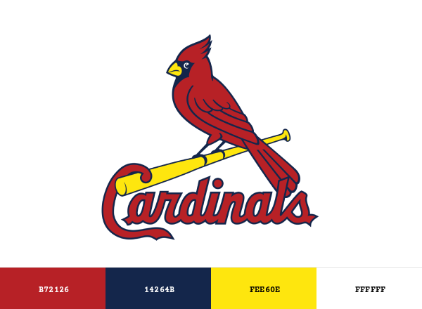
The St. Louis Cardinals are more than just a baseball team; they are a living emblem of tradition, resilience, and unyielding passion. Their colors and logo don’t merely adorn uniforms—they whisper stories of a franchise that has etched itself into the very fabric of America’s pastime. The cardinal red, the pristine white, and the bold navy blue aren’t just hues on a palette; they are the heartbeat of a city’s identity, a rallying cry for fans, and a visual testament to the team’s storied legacy. To understand the Cardinals is to decode a visual language that speaks in metaphors of fire and ice, of battle and triumph, where every shade and symbol carries the weight of generations.
The Cardinal’s Crimson: A Hue That Burns Eternal
The cardinal red of the St. Louis Cardinals isn’t just a color—it’s a conflagration frozen in time. This crimson, deep and luminous, is the visual equivalent of a roaring flame that refuses to be extinguished. It’s the color of dawn breaking over Busch Stadium, of victory parades that wind through the streets like rivers of fire, and of the unshakable loyalty of fans who drape themselves in it year after year. Unlike the sterile reds of corporate logos, this shade pulses with life, evoking the fiery plumage of the bird itself—a creature that symbolizes not just beauty, but fierce determination. In heraldry, red signifies both courage and passion, and the Cardinals have wielded this hue as a shield against mediocrity, a beacon for excellence. It’s a color that doesn’t just catch the eye; it seizes the soul, turning spectators into devotees and casual observers into lifelong believers.
The Navy’s Silent Strength: The Anchor of Tradition
Where the cardinal red blazes like a wildfire, the navy blue of the St. Louis Cardinals stands as an unyielding monolith—a silent sentinel that grounds the team’s identity in history. This isn’t the blue of a summer sky, but the deep, almost mystical hue of twilight, the color of constellations that have guided sailors home for centuries. Navy blue here is the color of steadfastness, of the unspoken promise that no matter how turbulent the season, the team will endure. It’s the shade of the Cardinals’ home uniforms, a visual anchor that contrasts sharply with the red, creating a dichotomy that feels as natural as day and night. This blue doesn’t shout; it whispers, but its message is unmistakable: tradition is not a relic, but a living force. It’s the color of the Cardinals’ past victories, of the players who came before, and of the future legends yet to emerge. In a league where logos and uniforms evolve with alarming frequency, the Cardinals’ navy blue remains a constant—a visual contract with their fans that says, “We will not fade.”
The Logo’s Hidden Language: A Symbol Woven with Meaning
The Cardinals’ logo is a masterclass in semiotics, a design so deceptively simple that its layers of meaning often go unnoticed. At first glance, it’s a cardinal perched on a bat, a straightforward emblem of the team’s namesake. But look closer, and the logo reveals itself as a cryptic poem. The bird’s posture is regal, its wings slightly raised as if caught mid-flight, a metaphor for the team’s relentless pursuit of greatness. The bat beneath it isn’t just a tool of the trade; it’s a scepter, a symbol of authority and dominance. The script beneath the bird—“St. Louis Cardinals”—isn’t merely text; it’s a signature, a mark of ownership over a city’s heart. Even the negative space between the letters forms a subtle continuity, a visual thread that binds the team to its fans. This logo doesn’t just represent a baseball team; it’s a sigil of identity, a mark that fans wear with pride, knowing that each time they see it, they’re part of something larger than themselves.
The Uniform’s Alchemy: Where Color Meets Character
The Cardinals’ uniforms are more than fabric and thread; they are alchemical concoctions where color and design transmute into something greater than the sum of their parts. The home whites, crisp and unblemished, are the canvas upon which the team’s legacy is painted. They’re the color of purity in the eyes of the game, the shade of a perfect inning, of a no-hitter thrown under the lights. The road grays, muted and understated, are the color of adaptability, of teams that travel with the weight of expectation but the grace of inevitability. The alternate uniforms, often a blend of red and navy, are the team’s chameleon skin, shifting with the mood of the season. But it’s the pinstripes—the thin, disciplined lines that run vertically down the uniform—that add the final touch of elegance. They’re the visual equivalent of a well-executed bunt, precise and purposeful, a reminder that greatness often lies in the details. Together, these elements create a uniform that doesn’t just identify the team; it elevates them, turning players into icons and games into legends.
The Psychology of the Palette: Why These Colors Resonate
The Cardinals’ color palette isn’t just aesthetically pleasing; it’s psychologically potent. Red, as we’ve established, is a color of energy and urgency, a hue that primes the brain for action. It’s the color of stop signs and emergency vehicles, a shade that commands attention and respect. Navy blue, on the other hand, is the color of stability and trust, a hue that soothes the mind and steadies the spirit. Together, they create a balance—fire and ice, passion and precision, chaos and control. Studies in color psychology suggest that such combinations can evoke a sense of harmony, making the Cardinals’ palette not just visually striking, but emotionally resonant. Fans don’t just wear these colors; they internalize them. The red fuels their fervor, while the navy blue grounds their loyalty. It’s a psychological one-two punch that makes the team’s brand unforgettable, a visual language that speaks directly to the heart.
The Legacy in the Hues: How Colors Shape a Franchise’s Soul
The St. Louis Cardinals’ colors and logo are more than design choices; they are the DNA of the franchise. They carry the weight of 11 World Series titles, of legends like Stan Musial and Bob Gibson, of moments that have defined generations. The red and navy blue aren’t just colors; they’re the threads that weave together the tapestry of the team’s history. Every victory, every heartbreak, every triumphant parade is etched into these hues, making them a living archive of the franchise’s soul. The colors are a bridge between the past and the present, a way for new fans to connect with the team’s storied legacy. They’re a reminder that the Cardinals aren’t just a team; they’re a tradition, a family, a city’s beating heart. In a world where brands come and go, the Cardinals’ colors endure, a testament to the power of design to transcend time.
The Fan’s Devotion: When Colors Become a Way of Life
To a Cardinals fan, the team’s colors are more than a uniform; they’re a second skin. The red and navy blue aren’t just seen—they’re felt. They’re the colors of childhood memories, of first trips to the ballpark, of the first time a fan’s heart raced at the crack of a bat. They’re the hues of weddings and funerals, of celebrations and solace, of a city that rallies around its team through triumph and tribulation. The Cardinals’ colors are a badge of honor, a symbol of belonging. They turn strangers into brothers and sisters, creating a community bound not just by geography, but by shared passion. The colors are a language, a way to communicate without words, to express loyalty in a single glance. They’re the reason why, on game days, the city of St. Louis is awash in a sea of red and navy, a living, breathing testament to the power of a brand to unite.