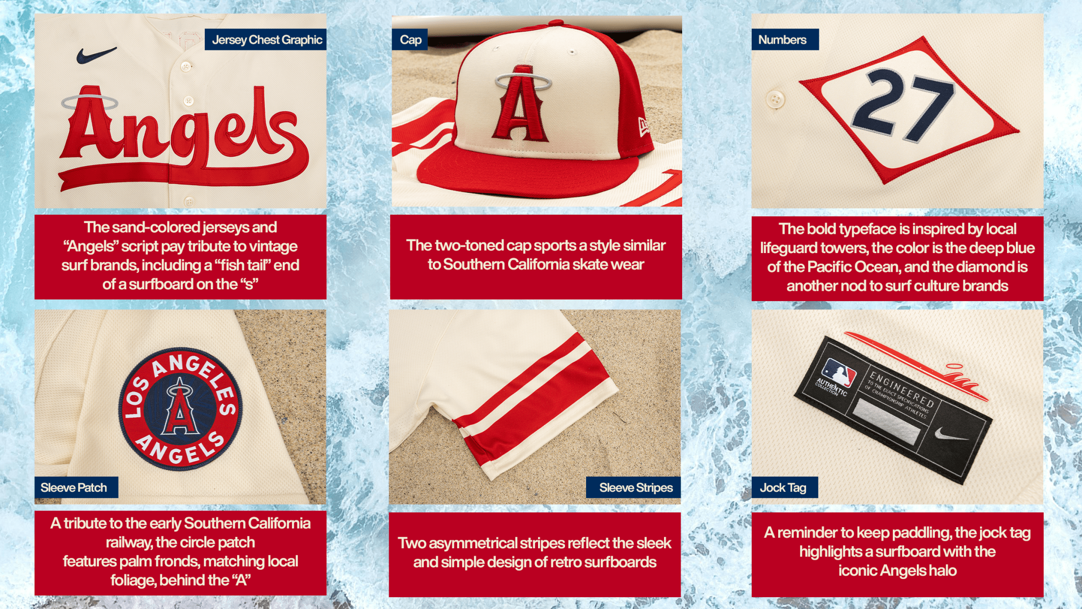
The Los Angeles Angels have long been a team of understated flair, their identity often overshadowed by the glitz of their city neighbors. Yet, with the unveiling of their City Connect hat, the franchise has not just stepped into the spotlight—it has redefined what it means to wear a baseball cap with purpose. This isn’t merely an accessory; it’s a sartorial manifesto, a bold declaration that the Angels are staking their claim in the cultural lexicon of modern sports aesthetics. The design transcends conventional team branding, weaving together the team’s heritage, the vibrancy of Los Angeles, and a forward-thinking vision that feels both nostalgic and revolutionary. But is it truly the best MLB design yet? To answer that, we must dissect the elements that make this hat a masterclass in visual storytelling.
The Aesthetic Revolution: Color as a Cultural Bridge
At first glance, the City Connect hat’s color palette is arresting—an audacious fusion of sunset orange and deep navy, hues that evoke the golden hour glow over the Pacific and the twilight hues of the Angels Flight Railway. This isn’t accidental. Los Angeles is a city of contrasts, where the relentless energy of downtown collides with the serene sprawl of its beaches. The Angels have distilled that dichotomy into a single accessory. The orange, a shade reminiscent of citrus groves that once blanketed the region, pays homage to California’s agricultural roots, while the navy anchors the design in the timelessness of classic baseball aesthetics. It’s a color story that doesn’t just represent a team but encapsulates an entire city’s soul.
What makes this palette so compelling is its rarity in MLB. Most teams cling to traditional reds, blues, or greens, but the Angels have embraced a spectrum that feels distinctly West Coast. It’s as if they’ve taken the neon glow of Hollywood Boulevard and the muted elegance of a Malibu sunset and compressed them into a single cap. This isn’t just a color choice; it’s a cultural statement, one that signals the team’s intent to stand apart in an era where uniformity often trumps originality.
The Typography Tells a Story: More Than Just a Name
The typography on the City Connect hat is a masterclass in restrained boldness. The word “ANGELS” is rendered in a sans-serif font that balances sharp angles with rounded edges, evoking both the precision of a baseball’s stitching and the organic curves of the city’s architecture. The letters are slightly condensed, giving the word a sense of urgency, as if the team is charging forward. But it’s the placement—the hat’s brim curves subtly to accommodate the text—that reveals the design’s sophistication. Unlike traditional caps where the team name sits flat, here it follows the natural contour of the brim, creating a dynamic interplay between text and form.
This isn’t just typography; it’s visual poetry. The font choice avoids the clichés of serif fonts that hark back to baseball’s golden age, opting instead for a modern, almost futuristic feel. It’s as if the Angels are saying, “We honor the past, but we’re not bound by it.” The spacing between letters is meticulous, ensuring readability without sacrificing style. Even the stitching that secures the patch to the cap mimics the precision of the typography, reinforcing the hat’s meticulous craftsmanship.
The Patch: A Window into the Team’s Soul
The patch on the City Connect hat is where the design transcends the ordinary. It’s not just a logo; it’s a narrative device. The central figure—a stylized angel with wings outstretched—is rendered in a way that feels both celestial and grounded. The wings are not delicate, feathery flourishes but bold, geometric shapes that suggest motion, as if the angel is in mid-flight. The body of the angel is a blend of navy and orange, creating a silhouette that’s instantly recognizable yet subtly abstract. This isn’t a literal representation; it’s an interpretation, a visual shorthand for the team’s identity.
What’s particularly striking is the patch’s placement. Unlike traditional team logos that sit prominently on the front, this one is slightly off-center, as if it’s caught in the act of taking flight. The stitching around the patch is a deep orange, a subtle nod to the cap’s primary color, but it’s the texture of the fabric itself that elevates it. The material has a slight sheen, catching the light in a way that makes the patch appear almost three-dimensional. It’s a detail that suggests the Angels are thinking about how their design interacts with the world beyond the stadium—how it looks in photographs, on social media, and in the hands of fans.
The Subtle Sophistication: Materials and Craftsmanship
A great design is only as good as its execution, and the City Connect hat excels in this regard. The materials used are a blend of performance and tradition. The cap itself is constructed from a high-quality cotton blend, giving it a softness that belies its durability. The brim is structured yet flexible, a nod to the practical needs of players while maintaining the hat’s aesthetic appeal. The interior features a moisture-wicking sweatband, a detail that speaks to the team’s commitment to modern comfort without sacrificing style.
The stitching is another area where the hat shines. The seams are clean, the threads a matching orange that blends seamlessly with the cap’s color scheme. Even the tags inside are understated, a small white label with the Angels’ logo in a muted gray. It’s the kind of attention to detail that elevates the hat from a mere accessory to a piece of wearable art. The craftsmanship suggests that this isn’t a one-off experiment but a long-term investment in the team’s identity.
The Cultural Resonance: Why This Design Matters
Baseball is more than a sport; it’s a cultural institution, and the Angels’ City Connect hat is a testament to that. In an era where teams are increasingly judged by their off-field presence, this design is a declaration that the Angels are not just players in the game but architects of its visual language. The hat doesn’t just represent the team; it represents Los Angeles itself—a city of dreams, diversity, and relentless innovation.
What makes this design truly remarkable is its ability to resonate on multiple levels. For longtime fans, it’s a nod to the team’s history, a way to honor the past while embracing the future. For new fans, it’s an invitation to be part of something bigger, a team that’s as vibrant and dynamic as the city it calls home. And for the casual observer, it’s a piece of art, a conversation starter, a way to connect with the soul of baseball in the 21st century.
The Angels have always been the underdogs of the MLB, but with this hat, they’ve taken a giant leap toward redefining what it means to be a team in the modern era. It’s not just the best design in baseball—it’s a blueprint for how sports can evolve without losing its soul.