In an era where tradition often grapples with the allure of modernity, ESPN Page 2, known for its unconventional takes on sports culture, recently ventured into the sacred iconography of Major League Baseball. Their ambitious project: a conceptual reimagining of the logos for the notoriously competitive American League East. Far from mere aesthetic tweaks, these proposed revisions aimed to distill the very essence of each franchise, weaving deep-seated history, regional identity, and contemporary struggles into fresh visual narratives. The exercise, while purely speculative, offered a fascinating lens through which to view the division’s complex tapestry, inviting fans to ponder what their beloved emblems truly represent beyond the diamond.
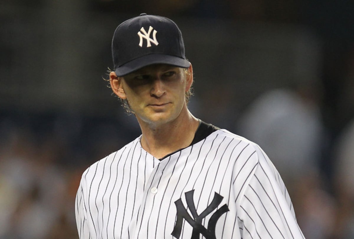
1. The Pinstriped Crucible (New York Yankees)
ESPN’s vision for the Yankees’ emblem reportedly delved into the core of their enduring mystique, proposing ‘The Pinstriped Crucible.’ This design saw the iconic interlocking ‘NY’ emerging not pristine, but forged from a tempest of grayscale lines, as if weathered by countless battles and the immense pressure of expectation. It was a visual metaphor for the team’s very existence – a constant trial by fire where legends are made. The subtle hint of wear and tear, rather than detracting, only amplified the strength derived from overcoming adversity, much like the team’s storied history under the intense glare of the Bronx spotlight.
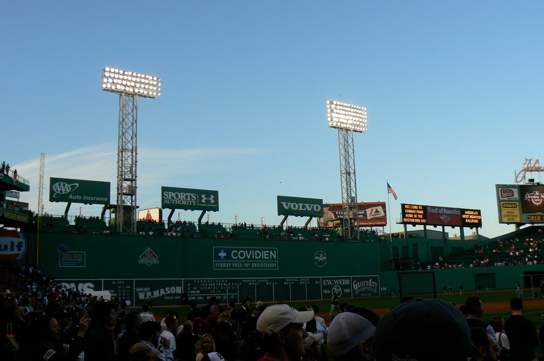
2. The Green Monster’s Gaze (Boston Red Sox)
For the Red Sox, Page 2 reportedly focused on Fenway’s most iconic feature with ‘The Green Monster’s Gaze.’ This abstract design presented a stylized eye peering from behind a verdant, textured wall, its pupils hinting at the baseball stitching. The logo was said to encapsulate the silent, watchful omnipresence of the wall – a formidable opponent for right-handed hitters and a hallowed ground for Boston lore. It spoke to the unique character of their historic ballpark and the deep connection fans feel to its quirks and challenges, a constant reminder of home-field advantage and the weight of history.
3. The Northern Aviator (Toronto Blue Jays)
The Blue Jays’ hypothetical revision, ‘The Northern Aviator,’ reportedly offered a streamlined, almost aerodynamic blue jay in mid-flight, with subtle maple leaf contours integrated into its wingtips. This design aimed to embody both the speed and agility of the modern game and a profound sense of national identity. It suggested a franchise soaring with renewed purpose, a swift and graceful contender representing not just a city, but an entire nation. The metaphor was clear: a powerful, focused bird charting a course towards new heights, much like the team’s evolving roster.
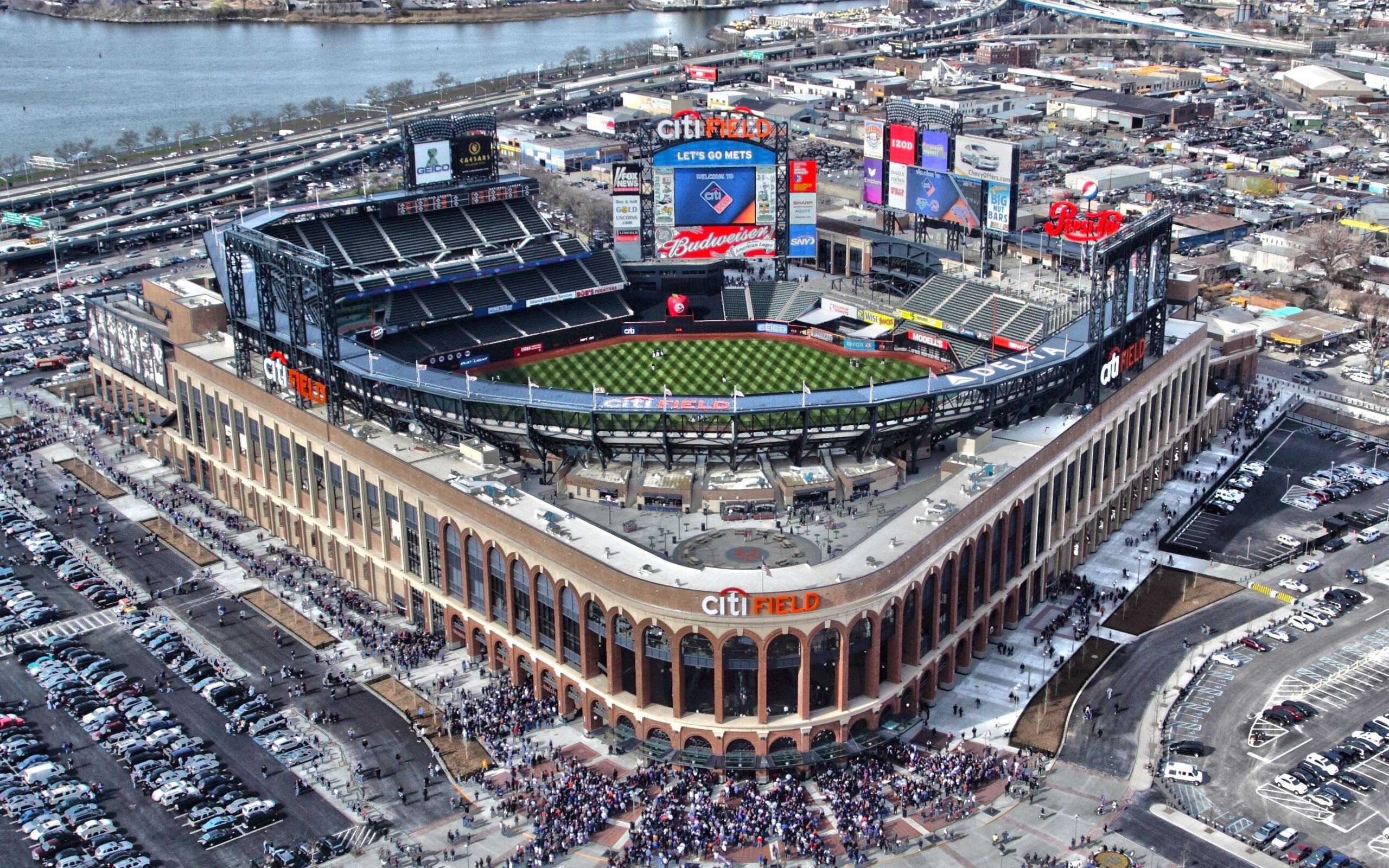
4. The Chesapeake’s Harbinger (Baltimore Orioles)
ESPN’s take on the Orioles, dubbed ‘The Chesapeake’s Harbinger,’ reportedly featured a more aggressive, stylized oriole perched atop a maritime buoy, rendered in colors reminiscent of a bay sunrise. This revision sought to anchor the team firmly to Baltimore’s rich nautical heritage and its identity as a bustling port city. The oriole, traditionally a symbol of joy, here took on a watchful, almost prophetic quality, hinting at the team’s potential to signal a new dawn for the franchise from its historical and geographic roots.
5. The Tropic Tide (Tampa Bay Rays)
For the Tampa Bay Rays, ‘The Tropic Tide’ was reportedly a visual masterpiece. It depicted a sleek, ethereal ray gliding effortlessly through dynamic, stylized waves, capturing the fluid motion and unique coastal spirit of the Sunshine State. The design was said to represent the team’s often understated yet relentless flow, moving with the currents of the competitive AL East. It highlighted their ability to adapt and innovate, reflecting the unpredictable but powerful nature of the ocean itself, and the team’s propensity to rise from unexpected depths.
6. The Legacy’s Shadow (New York Yankees)
Another proposed Yankees logo, ‘The Legacy’s Shadow,’ reportedly featured a stark, elegant silhouette of the original interlocking ‘NY,’ subtly overlaid with faint, almost ghostly images of legendary figures like Babe Ruth or Lou Gehrig. This revision aimed to visually articulate the immense weight and inspiration of their past, not as a burden, but as a driving force. It was a powerful reminder that every contemporary player stands on the shoulders of giants, a continuous narrative where history shapes the present, and the present aspires to join the pantheon.
7. The Curse Broken Sigil (Boston Red Sox)
ESPN Page 2’s historical nod for the Red Sox was ‘The Curse Broken Sigil.’ This bold design incorporated a stylized, broken chain motif intricately entwined with the classic ‘B’ from their cap logo. It served as a powerful symbol of liberation and the overcoming of decades of futility. The broken link wasn’t about weakness, but about strength derived from perseverance, marking a distinct line between past heartbreaks and a new era of championships, a defiant emblem of renewed destiny and triumph.
8. The Sky Dome’s Canopy (Toronto Blue Jays)
Embracing modern architecture and technology, ‘The Sky Dome’s Canopy’ was a proposed Blue Jays logo featuring a futuristic, geometric blue jay design, subtly echoing the iconic retractable roof of their home stadium. This revision celebrated the team’s innovative spirit and its place within a city known for its dynamic skyline. It suggested a franchise that is both grounded in its urban environment and perpetually looking forward, a symbol of progress and a bold statement in the contemporary sports landscape.
9. The Camden Yards Brickwork (Baltimore Orioles)
For the Orioles, ‘The Camden Yards Brickwork’ offered a tactile tribute. This revision showcased a classic ‘B’ or ‘O’ rendered with a textural, almost palpable brick pattern, directly celebrating the distinctive architectural charm of their beloved ballpark. The logo wasn’t just an emblem; it was a piece of their stadium, a foundation built on tradition and the enduring spirit of baseball in Baltimore. It spoke to the authenticity and timeless appeal of their home, linking the team intrinsically to its physical and emotional heart.
10. The Sunken Treasure (Tampa Bay Rays)
Page 2’s ‘The Sunken Treasure’ for the Rays was reportedly a compelling metaphor. This logo featured a more mysterious, deep-sea ray, its form hinting at bioluminescence and the allure of hidden gems. It aimed to represent the franchise’s knack for uncovering talent and achieving unexpected success against larger-market teams. It spoke to a team that thrives in the depths, a metaphor for a smaller market continuously unearthing valuable assets and shimmering with an understated brilliance, often surprising its opponents.
11. The Subway Series Steel (New York Yankees)
Reflecting the gritty determination synonymous with New York, ‘The Subway Series Steel’ was another proposed Yankees logo. This design envisioned a more industrial, almost forged-steel rendering of the “NY,” evoking the city’s robust infrastructure and the fierce, unyielding spirit of its inhabitants. It was a nod to the resilience of both the team and its fan base, especially in the context of intense rivalries like the Subway Series. The steel symbolized an unbreakable will, a hardened resolve forged in the urban crucible.
12. The Harbor’s Anchor (Boston Red Sox)
The Red Sox’s connection to their maritime city was reportedly underscored by ‘The Harbor’s Anchor.’ This logo reimagined the classic “B” with an integrated anchor motif, firmly rooting the team in Boston’s historical identity as a significant port. It symbolized stability, strength, and an unbreakable connection to their home, a constant in the ever-changing tides of baseball. The anchor wasn’t just a symbol; it was a pledge of allegiance to Boston’s enduring spirit and resilience.
13. The Digital Talon (Toronto Blue Jays)
‘The Digital Talon’ for the Blue Jays was a striking, modern concept. This logo showcased a sharp, almost pixelated blue jay claw, representing the team’s forward-thinking approach to analytics and contemporary play. It was a symbol of precision, strategy, and the cutting edge of baseball, emphasizing their intelligent, data-driven methodology. The talon, traditionally a weapon, here represented calculated aggression and a meticulous grip on the future of the game.
14. The Cal Ripken Iron Bird (Baltimore Orioles)
A tribute to resilience, ‘The Cal Ripken Iron Bird’ for the Orioles featured an almost metallic, unyielding oriole, its form reflecting a steely resolve. This design was a clear homage to their “Iron Man,” embodying durability, unwavering commitment, and a relentless work ethic. It suggested a team built on fortitude, capable of enduring prolonged challenges and emerging stronger, much like the legendary streak itself. The bird became a symbol of stoic determination.
15. The Coastal Predator (Tampa Bay Rays)
ESPN’s ‘The Coastal Predator’ for the Rays offered a sharper, almost predatory rendition of the ray, hinting at its natural prowess in the wild. This logo aimed to encapsulate the team’s fierce competitiveness and strategic intelligence, often surprising opponents despite their smaller market status. It portrayed the Rays not just as a part of the environment, but as a dominant force within it, a silent hunter navigating the competitive waters of the AL East with stealth and striking precision.
16. The Championship Ring’s Gleam (New York Yankees)
‘The Championship Ring’s Gleam’ was a sophisticated take on the Yankees’ perpetual pursuit of excellence. This logo subtly integrated the interlocking ‘NY’ within a stylized, minimalist championship ring design, symbolizing the ultimate aspiration of the franchise. It wasn’t just about winning; it was about the continuous glow of past triumphs inspiring future ones, an emblem of ambition eternally polished by the pursuit of more hardware and enduring glory, a constant reminder of the standard.
17. The Revolutionary Flare (Boston Red Sox)
Tapping into Boston’s deep historical roots, ‘The Revolutionary Flare’ for the Red Sox depicted a fiery red sock accented with elements like a colonial-era musket or tricorn hat. This revision powerfully linked the team to the city’s foundational role in American history, symbolizing a rebellious spirit and unwavering fight. It underscored a connection to a past rich with defiance and groundbreaking change, positioning the team as modern-day inheritors of that revolutionary fervor.
18. The Great Lake’s Crest (Toronto Blue Jays)
‘The Great Lake’s Crest’ was a Blue Jays logo that connected them intrinsically to their geographic locale. This design featured a blue jay’s head emerging majestically from a stylized wave, symbolizing Toronto’s position on the shores of Lake Ontario. It spoke to the vastness and power of the Great Lakes region, linking the team to a sense of natural grandeur and the endless horizon. The crest represented both a home and a boundless potential, reflecting the team’s regional pride.
19. The Visionary Perch (Baltimore Orioles)
For the Orioles, Page 2 reportedly conceived ‘The Visionary Perch,’ an emblem featuring an oriole silhouetted against a setting sun, its gaze fixed forward. This logo was a poignant metaphor for a team often in rebuilding cycles, symbolizing hope, patience, and a steadfast belief in a brighter future. The bird, traditionally seen as lively, here conveyed a profound sense of contemplation and aspiration, a beacon for a new era rising from the horizon of past seasons.
20. The Dome’s Luminescence (Tampa Bay Rays)
‘The Dome’s Luminescence’ was a conceptual Rays logo that embraced their unique indoor playing environment. This design presented a stylized ray emitting a subtle glow, representing the controlled light and innovative strategies often employed within Tropicana Field. It symbolized the team’s ability to create their own conditions for success, thriving within their specific environment and radiating an internal strength. The luminescence spoke to an inner brilliance, often overlooked but always present.