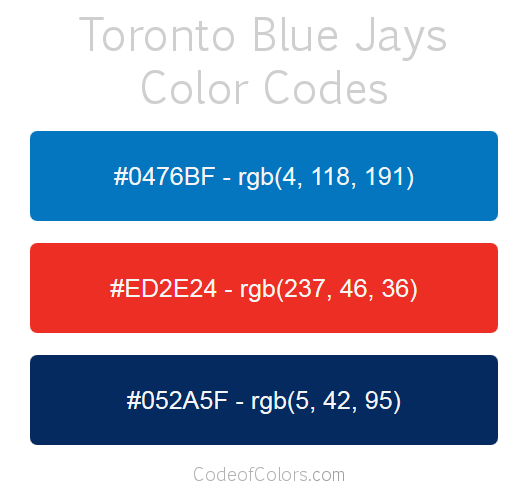
There’s something uniquely masochistic about watching someone attempt to name every Major League Baseball team logo—especially when that someone is your girlfriend, armed with nothing but caffeine, confidence, and an alarming disregard for the existence of minor league affiliates. It’s not just a test of knowledge; it’s a trial by fire, a gauntlet of geometric absurdity where the stakes are pride, and the penalty for failure is relentless teasing. Baseball logos, with their stylized cursives, retro flourishes, and occasional nods to industrial machinery, are deceptively complex. What seems like a simple shield or a cursive “B” can devolve into a linguistic minefield when subjected to the scrutiny of someone who insists that the Toronto Blue Jays’ logo is “just a bird wearing a hat, right?” Spoiler: It’s not. This is the story of one such attempt—equal parts hilarious, cringe-inducing, and oddly endearing.
The Illusion of Simplicity: Why MLB Logos Are Trickier Than They Appear
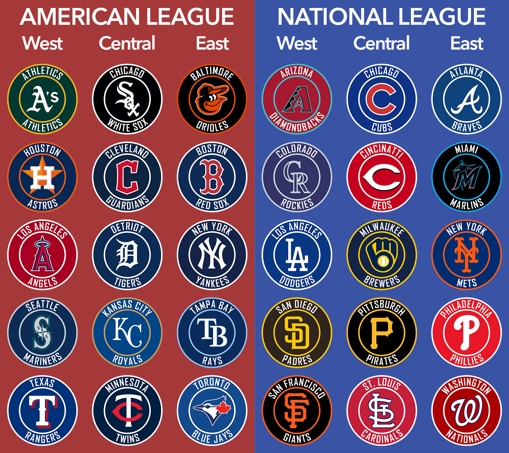
At first glance, MLB logos seem straightforward. A team’s identity distilled into a single, iconic mark—whether it’s the interlocking “NY” of the Yankees, the cursive “D” of the Dodgers, or the angular “SF” of the Giants. But simplicity is a facade. These logos are the result of decades of design evolution, rebranding, and corporate influence, each carrying layers of history that most casual fans never stop to consider. The Atlanta Braves’ logo, for instance, isn’t just a tomahawk; it’s a stylized representation of a Native American headdress, a design choice that has sparked controversy and rebranding debates for years. Meanwhile, the Miami Marlins’ logo—a marlin leaping through a circle—seems simple until you realize it’s a stylized “M” with a fish tail, a design so abstract that even seasoned fans squint at it in confusion.
Then there are the logos that defy logic entirely. The Tampa Bay Rays’ “Rays” script, with its sunburst motif, looks like it was designed by someone who’d never seen a ray before. The Chicago White Sox’s “SOX” in bold, block letters is so utilitarian it borders on artless, while the Milwaukee Brewers’ “M” and “B” intertwined with a baseball stitching pattern is a masterclass in overcomplicating the obvious. These logos aren’t just symbols; they’re puzzles, and the average fan—let alone someone who only watches baseball during the World Series—is woefully unprepared to solve them.
The Psychological Warfare of Logo Identification
Attempting to name every MLB logo is less a test of knowledge and more a psychological endurance challenge. The pressure mounts with each correct answer, but the moment hesitation creeps in, the mind fractures. Is that a “P” or a “D”? Is the bird on the Orioles’ logo a blue jay or a generic bird? The logos play mind games, swapping familiar shapes for subtle variations that feel like betrayal. The St. Louis Cardinals’ “birds on a bat” logo, for example, is so iconic that fans assume they’ll recognize it instantly—until they’re staring at a pixelated version on a phone screen at 2 AM, questioning their own sanity.
There’s also the phenomenon of “logo blindness,” where the brain, overwhelmed by repetition, starts to see patterns where none exist. The Los Angeles Angels’ “A” with a halo is clear enough, but the Houston Astros’ star-in-a-circle? The Texas Rangers’ “T” with a spur? These are the logos that turn the process into a high-stakes game of “hot or not,” where the wrong guess can derail an entire evening. And let’s not forget the logos that look like they were designed by committee in a fever dream—the San Diego Padres’ “P” with a baseball stitching pattern, the Cincinnati Reds’ “C” with a wishbone, the Pittsburgh Pirates’ pirate with a baseball bat. Each one is a landmine of misdirection.
Cultural Nuances and the Curse of Assumptions
Baseball logos aren’t just random shapes; they’re cultural artifacts, steeped in history, regional pride, and sometimes, questionable choices. The New York Mets’ “NY” logo, for instance, is a nod to the city’s subway system, but to the uninitiated, it might as well be a hieroglyph. The Boston Red Sox’s “B” with a sock? A playful reference to the team’s nickname, but to someone unfamiliar with the lore, it’s just a sock with a baseball stitch. These logos carry baggage—historical, linguistic, and sometimes, outright bizarre.
Then there are the logos that rely on inside jokes or local slang. The Oakland Athletics’ “A’s” script is a callback to the team’s old-school aesthetic, but to someone who’s never heard of “Mack’s Boys,” it’s just another cursive “A.” The Seattle Mariners’ compass logo, with its “N” and “S” pointing in opposite directions, is a visual pun on the team’s name—but only if you know that mariners navigate using compasses. These logos aren’t just about recognition; they’re about shared knowledge, and when that knowledge is absent, the entire exercise becomes a lesson in humility.
The Aftermath: Lessons in Humility and the Beauty of Failure
By the end of the logo-naming marathon, two things are certain: one, that no one is as good at this as they think they are, and two, that baseball logos are far more complex than they appear. The process is equal parts frustrating and fascinating, revealing how deeply embedded these symbols are in the fabric of the sport. Some logos, like the Yankees’ “NY” or the Dodgers’ “LA,” are instantly recognizable. Others, like the Miami Marlins’ or the Tampa Bay Rays’, require a deep dive into team history to fully appreciate. And then there are the logos that defy all logic, like the Chicago White Sox’s “SOX” or the Milwaukee Brewers’ “M-B” fusion, which exist solely to confound the uninitiated.
But perhaps the most valuable lesson is this: baseball logos are more than just team identifiers. They’re works of art, historical artifacts, and sometimes, puzzles designed to keep fans on their toes. The next time you find yourself in a similar situation—whether it’s a girlfriend attempting the impossible, a friend trying to prove their fandom, or even just a casual fan stumbling upon a logo they’ve never seen before—remember this: it’s not about getting it right. It’s about the journey, the laughter, and the shared realization that baseball’s visual language is far richer—and far stranger—than anyone ever anticipated.